
The team
2 Design System Designers
2 Front End Engineers
Product Manager
Design Director
Role
I was one of the two designers tasked to audit the enterprise products, create components and required variations, stress test our components for flexibility and scalability, address feedback, write documentation for how components would work in the design system, and collaborate with the front end engineers on execution of the design.
Timeline: 8 months
Overview
A design system and component library built from the ground up
For the privacy of the client, it will be referred to as Cardigan. Cardigan has various teams that focus on unique but connected products with one or two designers specifically allocated to a single product.
Problem to solve
Inconsistencies and inefficiencies
We found that designers were creating many similar components from scratch or having to solve for similar UI solutions as other products. Designers frequently had to check in with one another to check for existing patterns and the Figma files were linked to too many different libraries. Not only did this disrupt workflows for designers and developers, but long term it would create a brand and experience discrepancy across a family of enterprise products.
How do we both improve design processes and create a consistent, scalable experience in a portfolio of products for a large enterprise company?
How do we both improve design processes and create a consistent, scalable experience in a portfolio of products for a large enterprise company?
Our goal
Help designers design and developers code
As with any design system, the goals of ours was to streamline the product development process, establish a unified visual identity across a diverse range of enterprise software solutions, and prepare our product teams for scalability. We approached the process of building a component library treating our internal designers and front-end engineers as our core users. We selected the design system elements based on Cardigan’s product strategies and we built them out as Figma components that had flexibility for building out workflows. Throughout our design process, we partnered with developers to ensure the Storybook component library reflected the interactive patterns we built in Figma.
Design principles
Laying out the foundation for our design decisions
To ensure that our design team had a benchmark for our design decisions, we aligned every Figma element we designed and built out to these principles:
1. Accessible and inclusive: From ensuring we have proper color contrasts to how we styled interactive states, our component library was built to comply with the Web Content Accessibility Standards (WCAG 2.1).
2. Modular and reusable: The design system not only should bring consistency across the family of products but should help solve a majority of UX and UI problems so designers and developers have more time to innovate and solve core problems.
3. Scalability: The elements of our design system allows for easy maintenance and updates with minimal disruption to the design process.
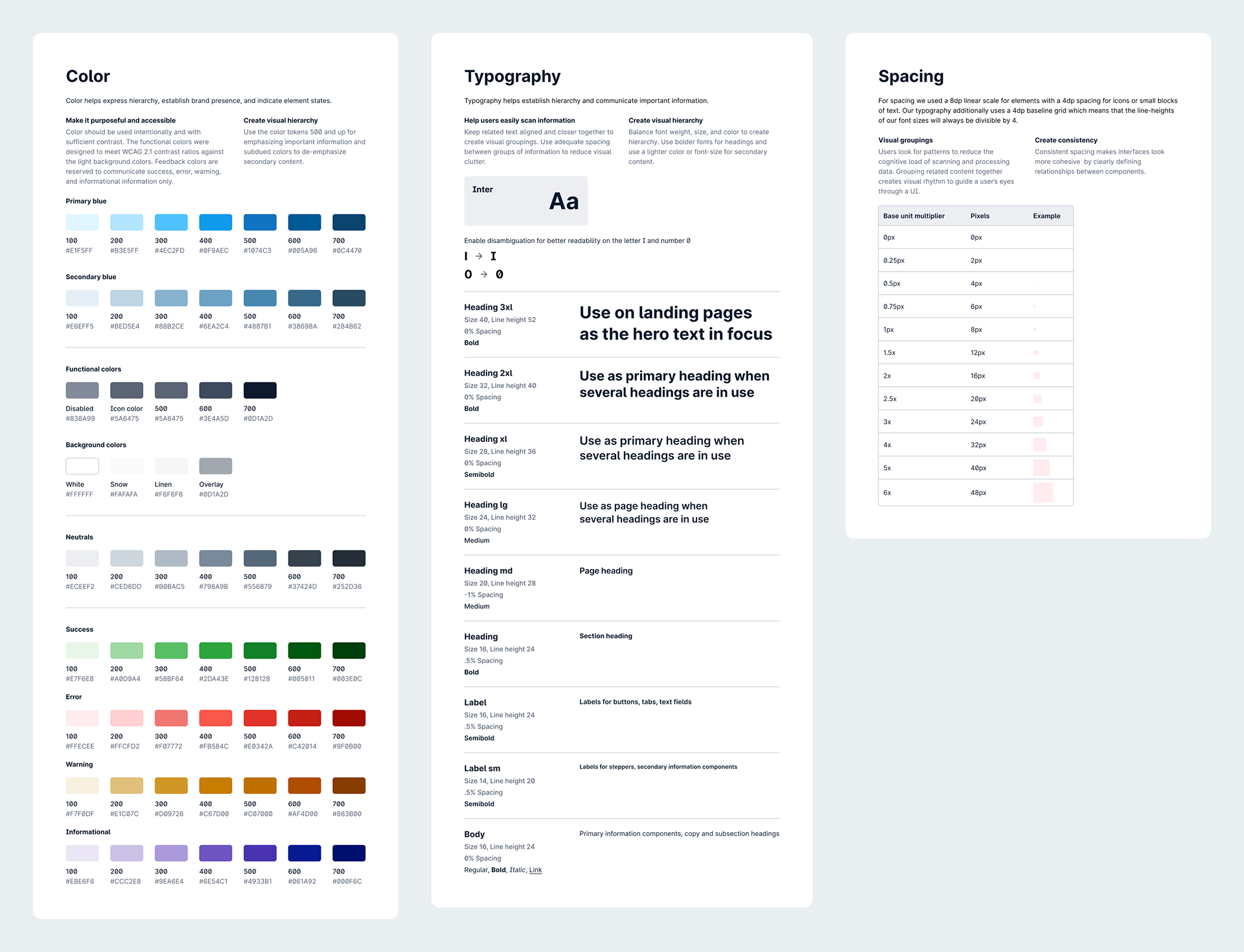
Foundation
Start with color, typography, and spacing
Though color and typography would continue to be refined through different iterations, we tried to lock down a color palette, typography, and spacing before we began work on the other components. To support the extensibility of our design system, we selected a color palette with sufficient contrast baked in and a legible typography scale.
Components
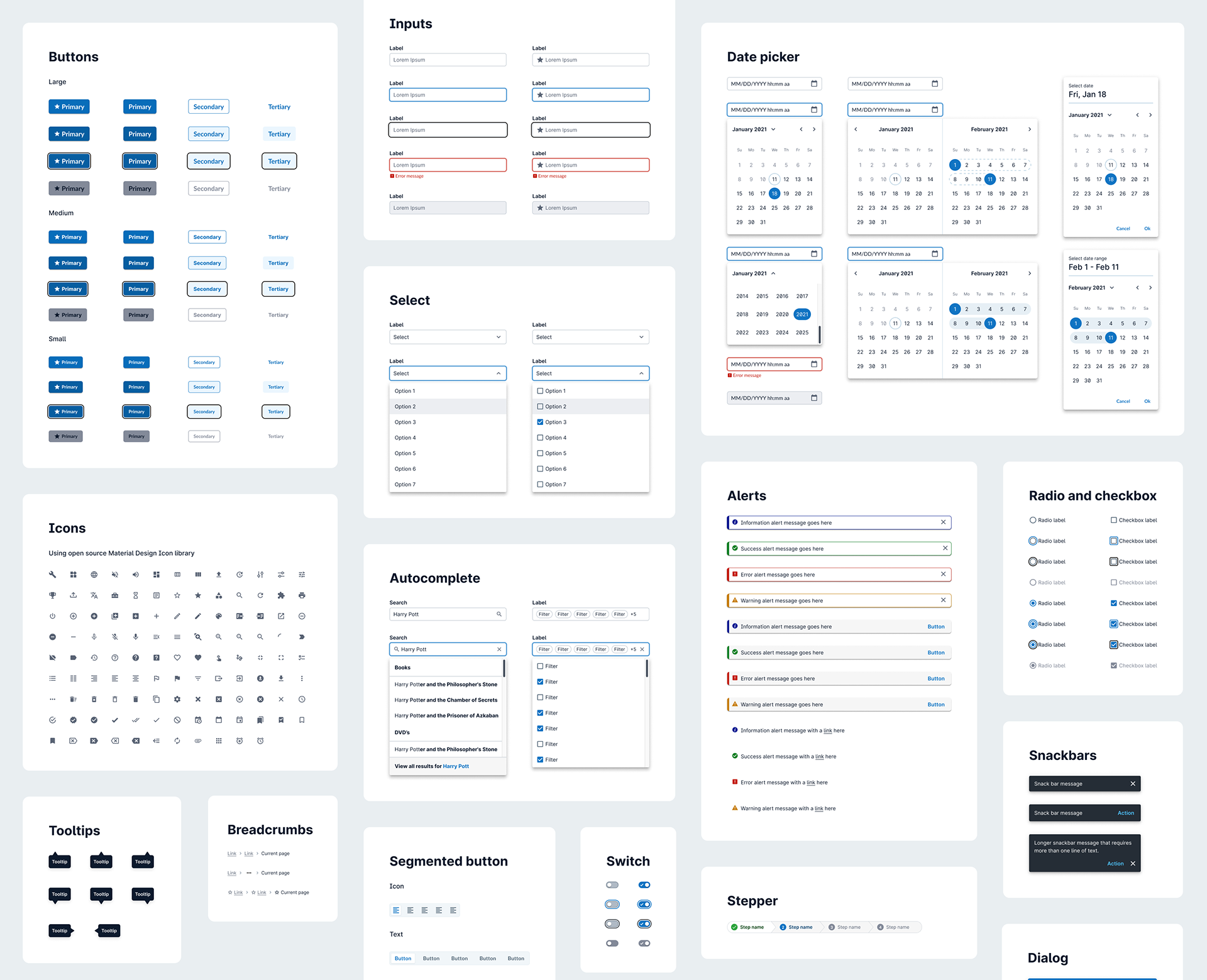
Building out an extensive components library
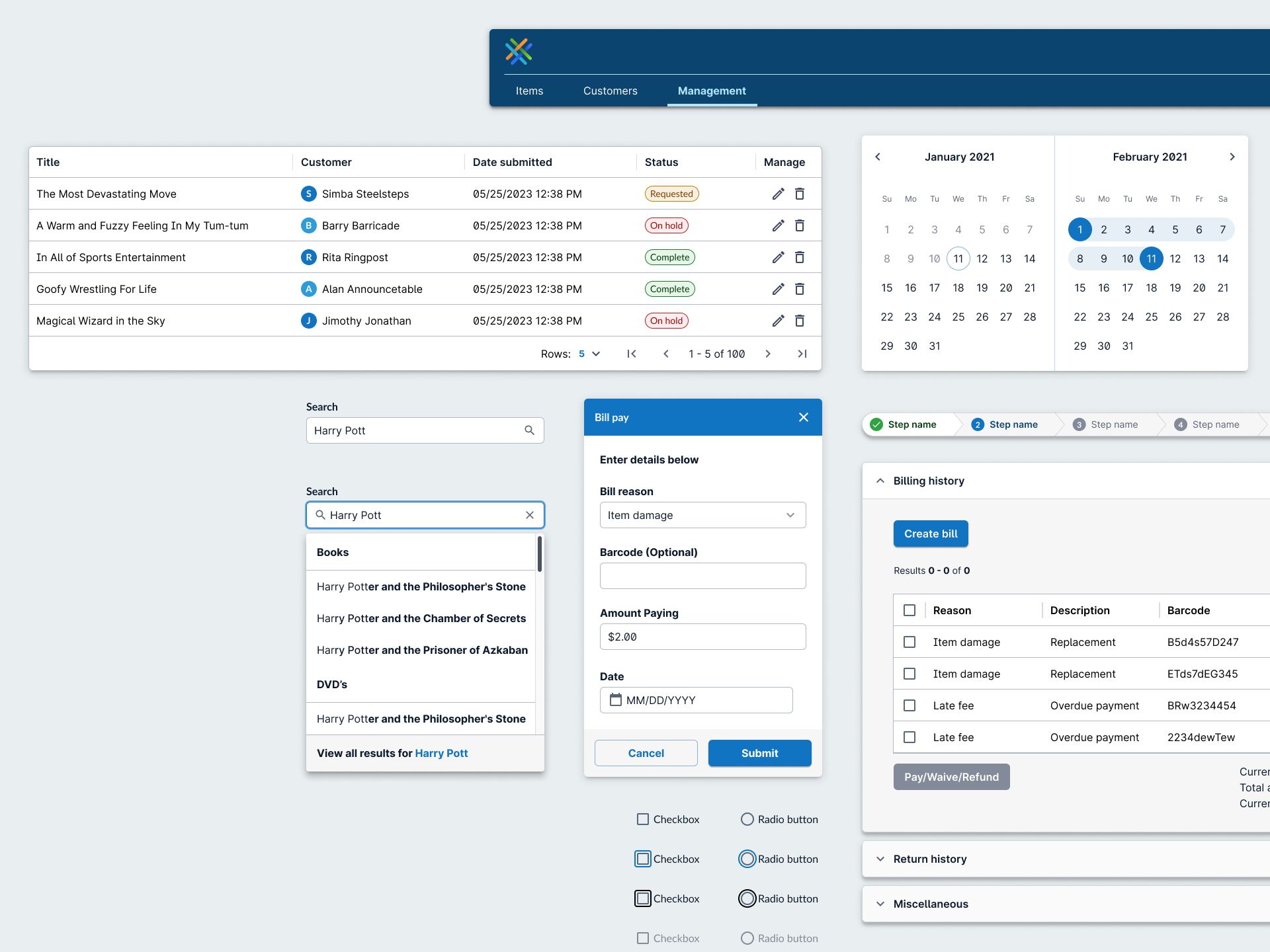
With color, typography, and spacing established, we would then build out basic components that would be frequently used in workflows such as buttons, icons, and text fields. For each component we built out we included interactive states such as hover, focus, and error and if applicable special variations such as icon placement or labels. Each component work began with an audit of current use in our products which helped inform the requirements for variations, sizes, the inter-relationships of components, and how the component was used for workflows.
Documentation
Rules for delivering a more predictable UI
Beyond building the component library, we additionally had to consider how our users would be using it. Our documentation included but was not limited to:
Component anatomy: What goes into each component including labels, icons, and padding
Interactive patterns: States, use cases, and placement within the context of the UI
Colors: Expected colors for a component and its states
Figma guidance: For our designers, we additionally provided Figma guidance to enhance their use of the library
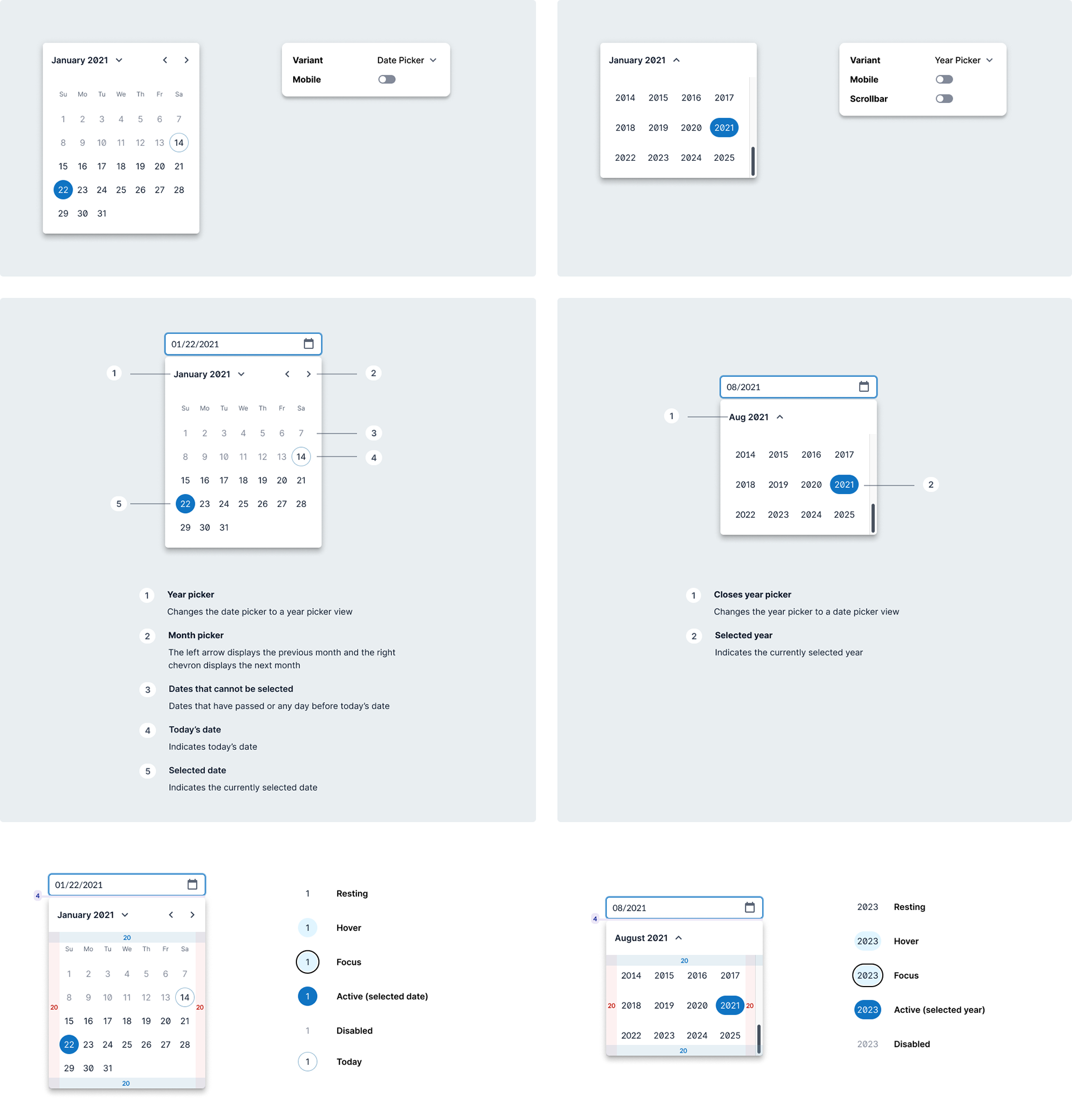
Date picker documentation snippet
Iterating
Stress testing our library revealed gaps we did not account for
While we were building a design system, we were additionally building a Figma component library. We had to solve challenges of system thinking and also navigating the constraints of designers using Figma. Our solutions had to ensure we were not compromising the best solution for the design system as a whole.
Dialog component
The initial iteration of the dialog component was built with selectable content types which were selected based on the most common dialog content types. The intention of the design was to allow designers to pull a dialog component easily from the component library and toggle between the different variants at the top level of the component.
Pros:
• Preserve drop shadow of dialog
• User can toggle mobile variant and other settings at the top level of the component
Cons:
• Designers may have to detach the instance of the component in order to create their own dialog content due to the preset content types
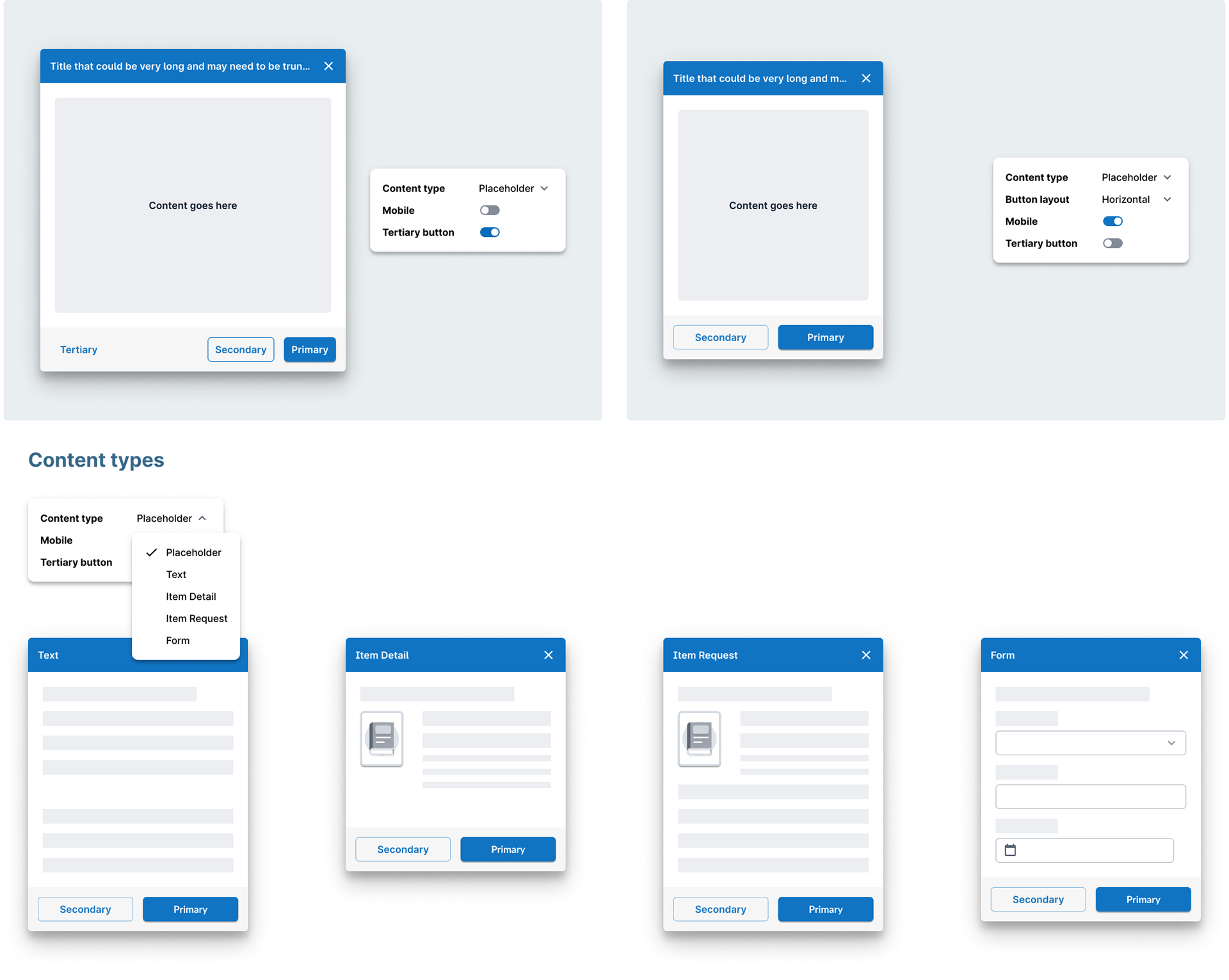
First iteration of dialog components
In the final iteration, in order to offer the designers flexibility of adding different types of content with the dialog, I opted to create templates in Figma that contained the header and footer as the main dialog components and an editable content area preset with proper padding and margins.
Pros:
• Users can customize their own dialog content
• All dialog variations are accounted for in the Figma templates ready to copy and use
• Templates preserve the dialog drop shadow
Cons:
• One payoff to the templates is that it cannot be pulled directly from the component library. While users can pull the dialog components, the templates have to be pulled from the template file.
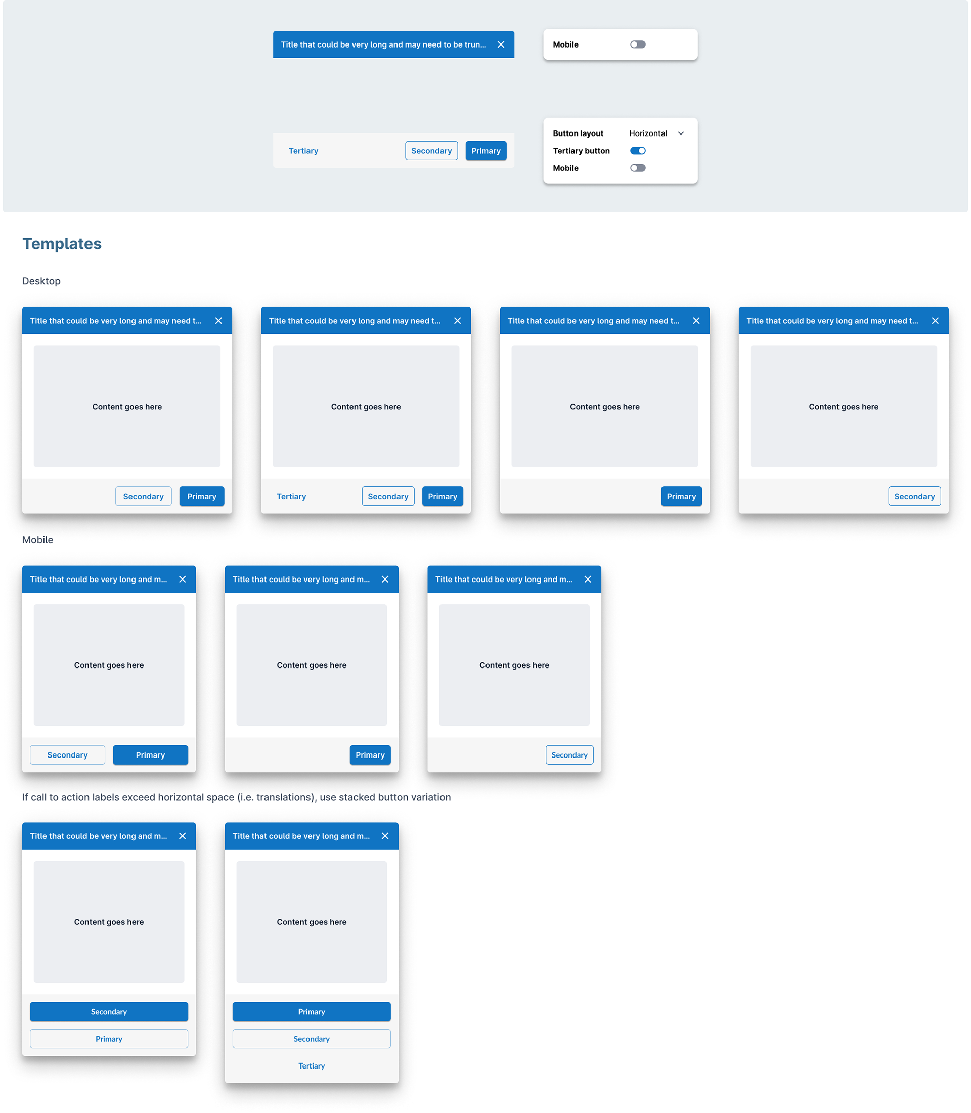
Final iteration of dialog component templates
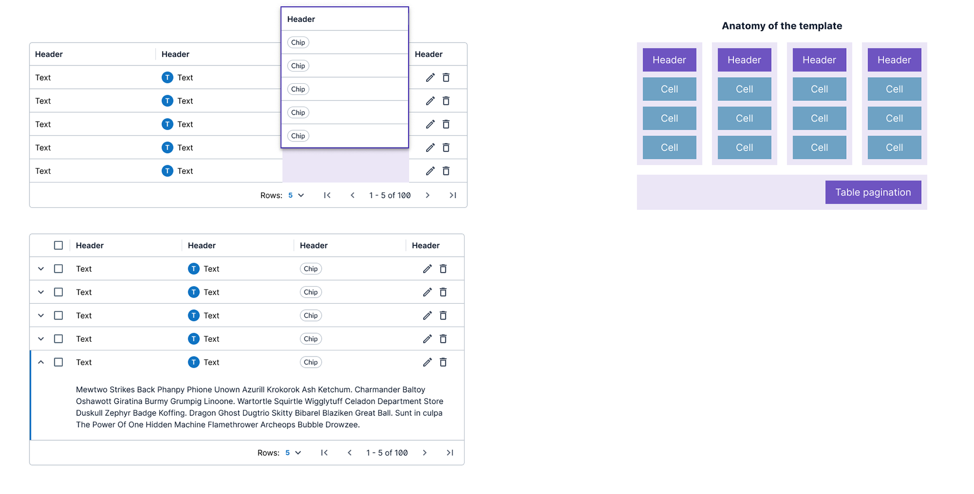
Data grid component
Like the dialog component, data grid cell content could vary across different use cases. However, cell content does have common, I built different preset cell type variants including text, icons, chips, avatar, and form fields. Designers feedback from the new dialog templates informed us that templates were useful for understanding how to use the components and helped speed the design process up.
Pros:
• Templates bridge learning curve for using components and provide the foundation for building data grids
• Preset cell variants represent the most common types of data found in tables which should speed the process of building out data grids
• Recommended visual consistency across same types of data can be applied at the component level without designers having to read additional guidelines
Cons:
• When the content of the cells requires more complexity, users will have to detach the component to build their own but with templates in place, they have the foundation on which how to layout the content
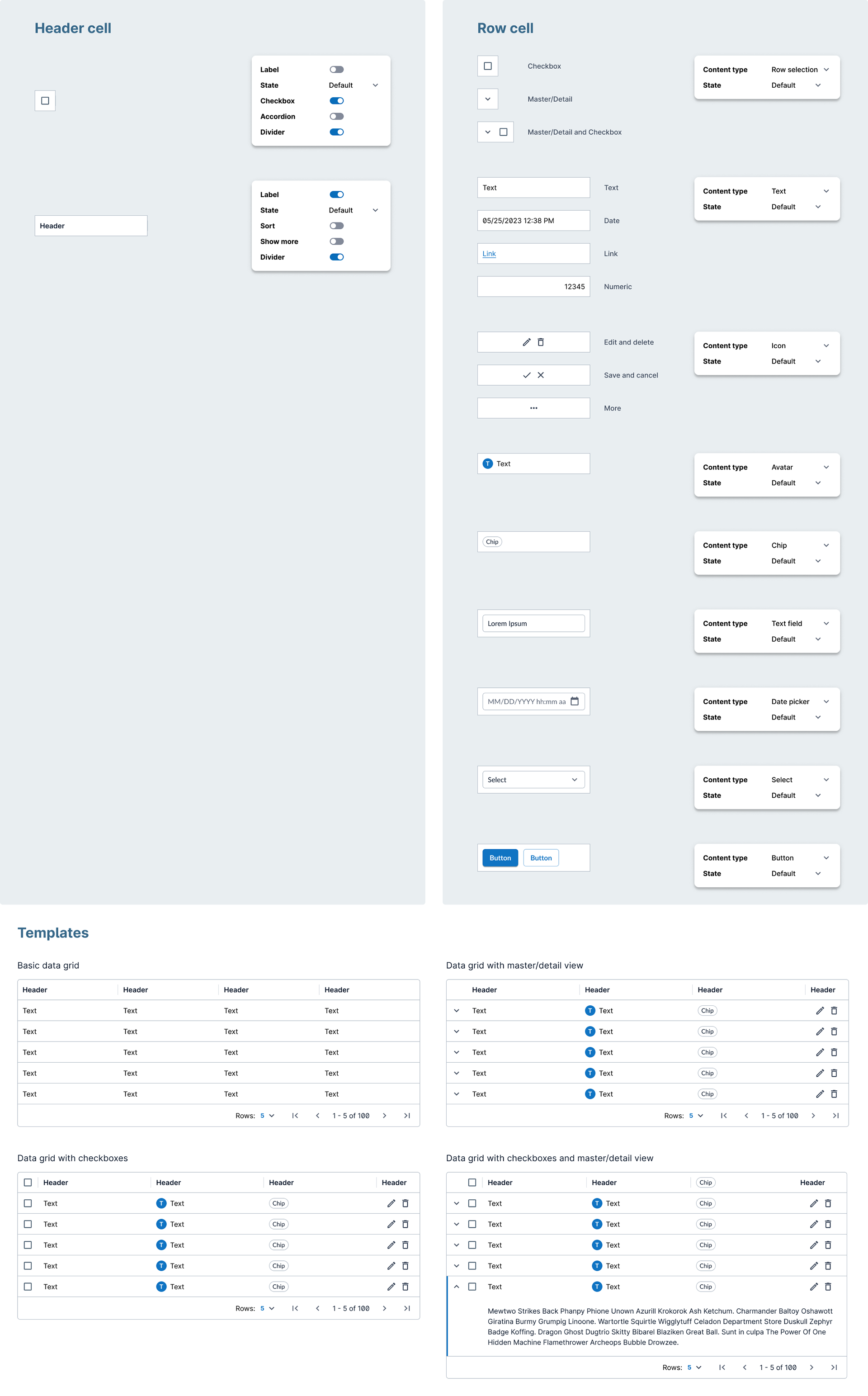
Final iteration of data grid templates
To further improve the flexibility of the templates, I created two sets of templates for data grid: one based on rows, and another based on columns with added notes on the benefits of using either.
Template with rows
• Best used for creating data grids with master/detail structure as designer can organize and reorganize on a row by row basis
• Header is built with a horizontal autolayout
• Rows are built with a horizontal autolayout
• Header is built with a horizontal autolayout
• Rows are built with a horizontal autolayout
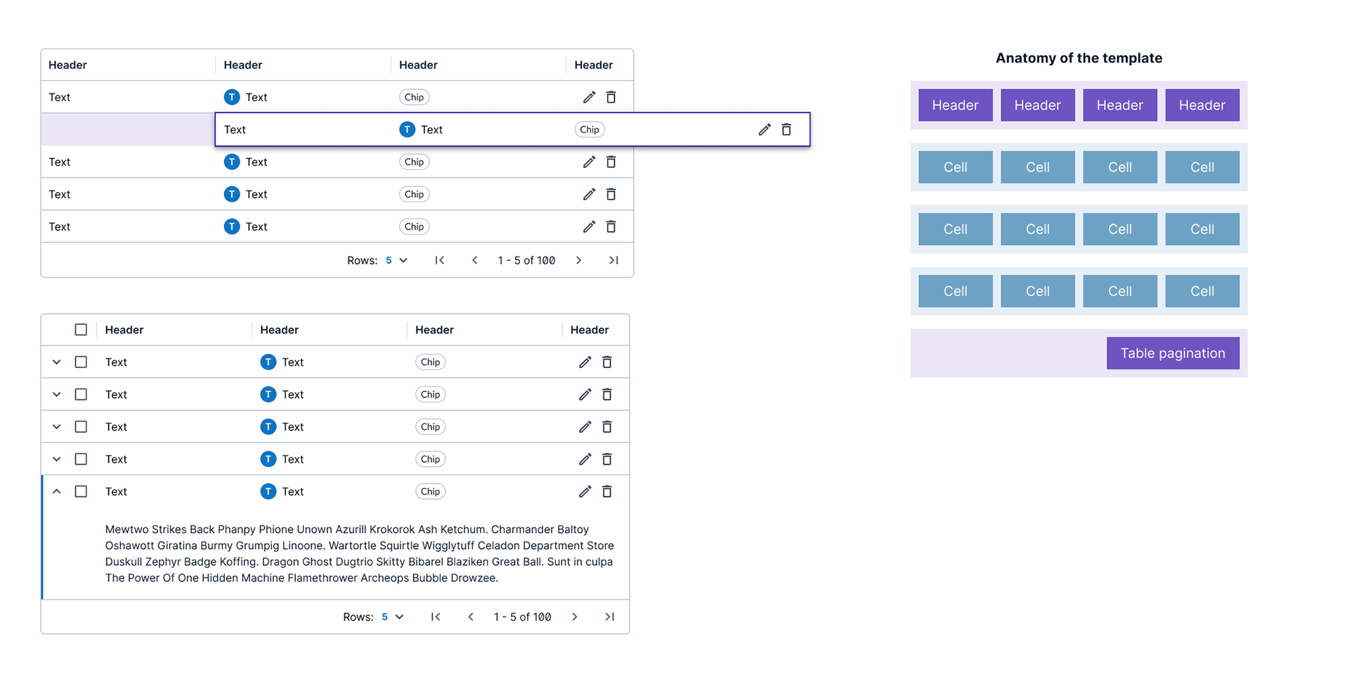
Template with columns
• Best used for creating data grids with many columns
• Column widths can be quickly managed
• Header is built with vertical autolayout as a column with its corresponding data cells
• Not recommended for master/detail design
• Column widths can be quickly managed
• Header is built with vertical autolayout as a column with its corresponding data cells
• Not recommended for master/detail design
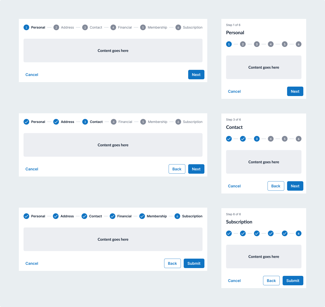
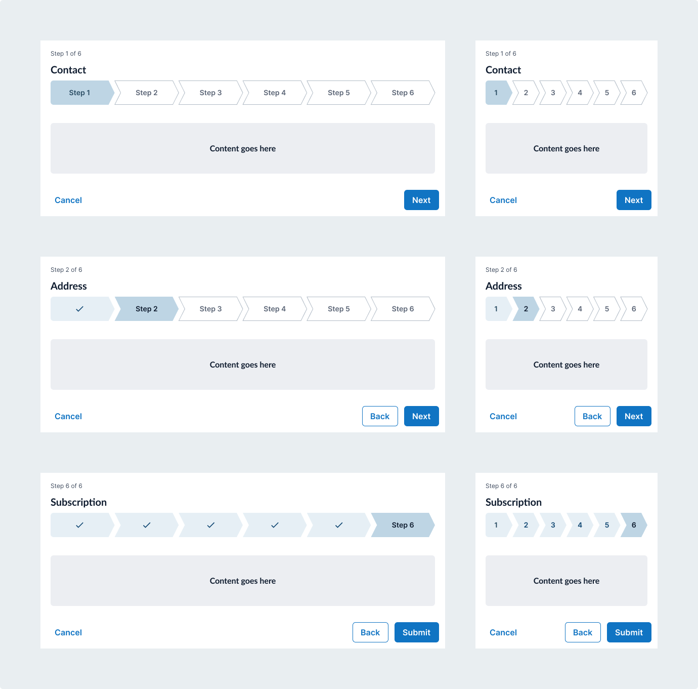
Stepper component
The design requirements that came from design leadership for the stepper was that it had to have enough presence on the page to show the user where they are in a process while not overpowering the content itself. Early concepts confirmed best practices to have a minimum of 3 and a maximum of 6 steps for the stepper. Designing this component generated the most amount of different opinions on the actual visual design and required more deliberation on the final recommendation.
Iteration 1:
Pros:
• Out of the box experience from the framework that our developers were using meaning minimal development work
• Familiar mental model that consumers would recognize
Cons:
• Design leadership felt that the design of stepper was not impactful enough to convey progress
• Longer labels such as long translations would require truncation
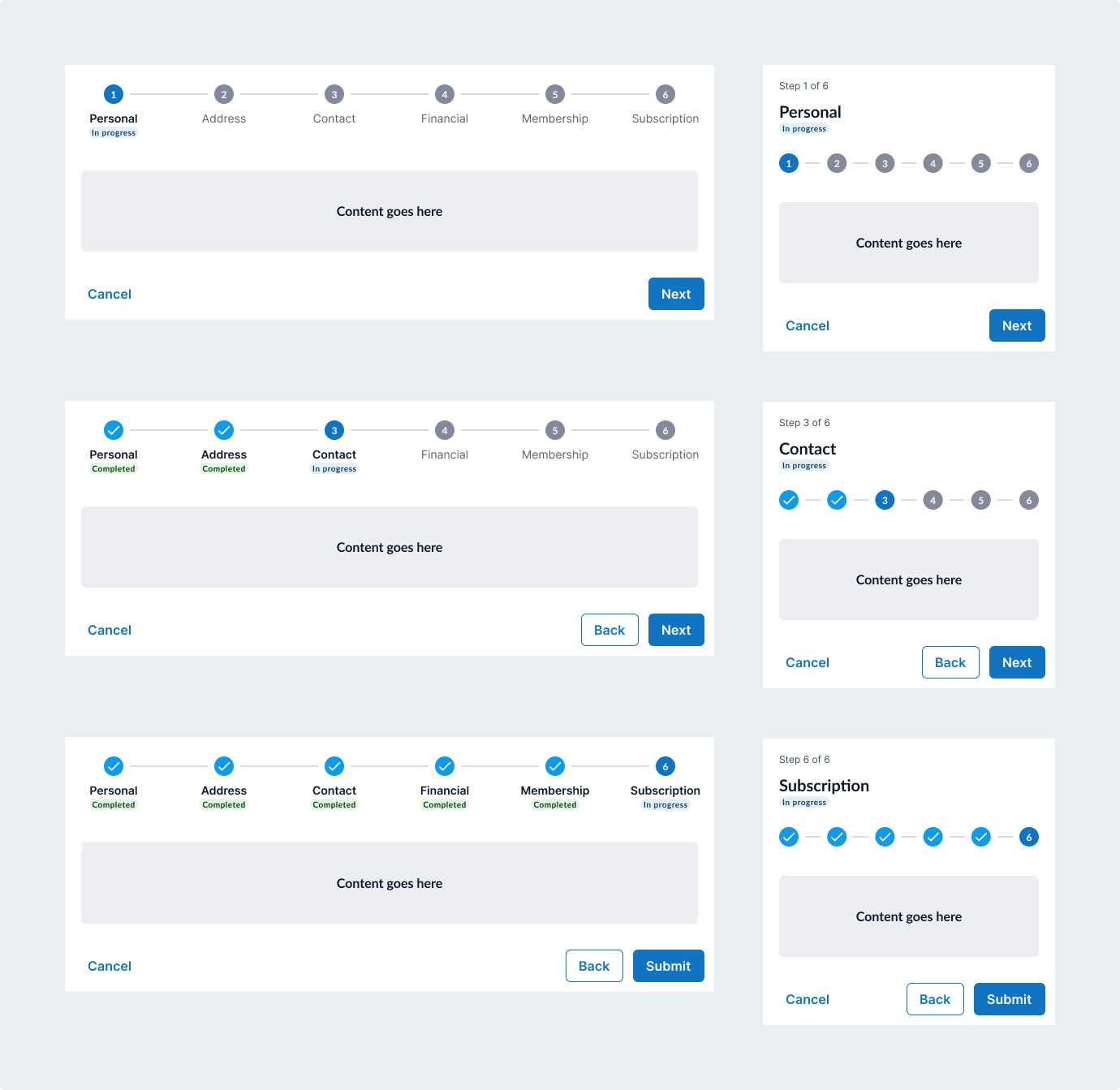
Iteration 2:
Pros:
• Minimal changes to the out of the box experience from the framework that our developers were using
• Use of labels to indicate progress status showed additional clarity
• Different color used to add differentiation between complete and in progress
• Pulling the label out of the same horizontal plane alleviated some constraints on the label length
Cons:
• Design leadership still felt that the design of stepper was not impactful enough to convey progress even with the additions of the badges
• The colors of the checkmarks did not correlate to the colors of the badges
• Takes up too much top real estate of the page
Iteration 3:
Pros:
• Design leadership liked the visual indication of progression and felt that while the colors needed work, this design direction could help bring the right amount of balanced focus between the stepper and the content
• Pulling the label name out of the visual alleviates any constraints of label lengths
Cons:
• Colors needed some work to convey the states of progression
• Step name removed from the visual in the desktop version created disconnect from what the name of the step is
• Takes up too much top real estate of the page
Due to the high reception of iteration 3, I elaborated more on "chevron" visual for the final iteration. I used the feedback from iteration 2 regarding color to reintroduce green to represent a completed step. I additionally reduced the top and bottom padding so that the stepper takes minimal real estate on the page.
The minimum and maximum amount of steps is set by allowing users to select their number of steps at the top level of the component. At the sublevel of the component, users can adjust the state of each individual step.
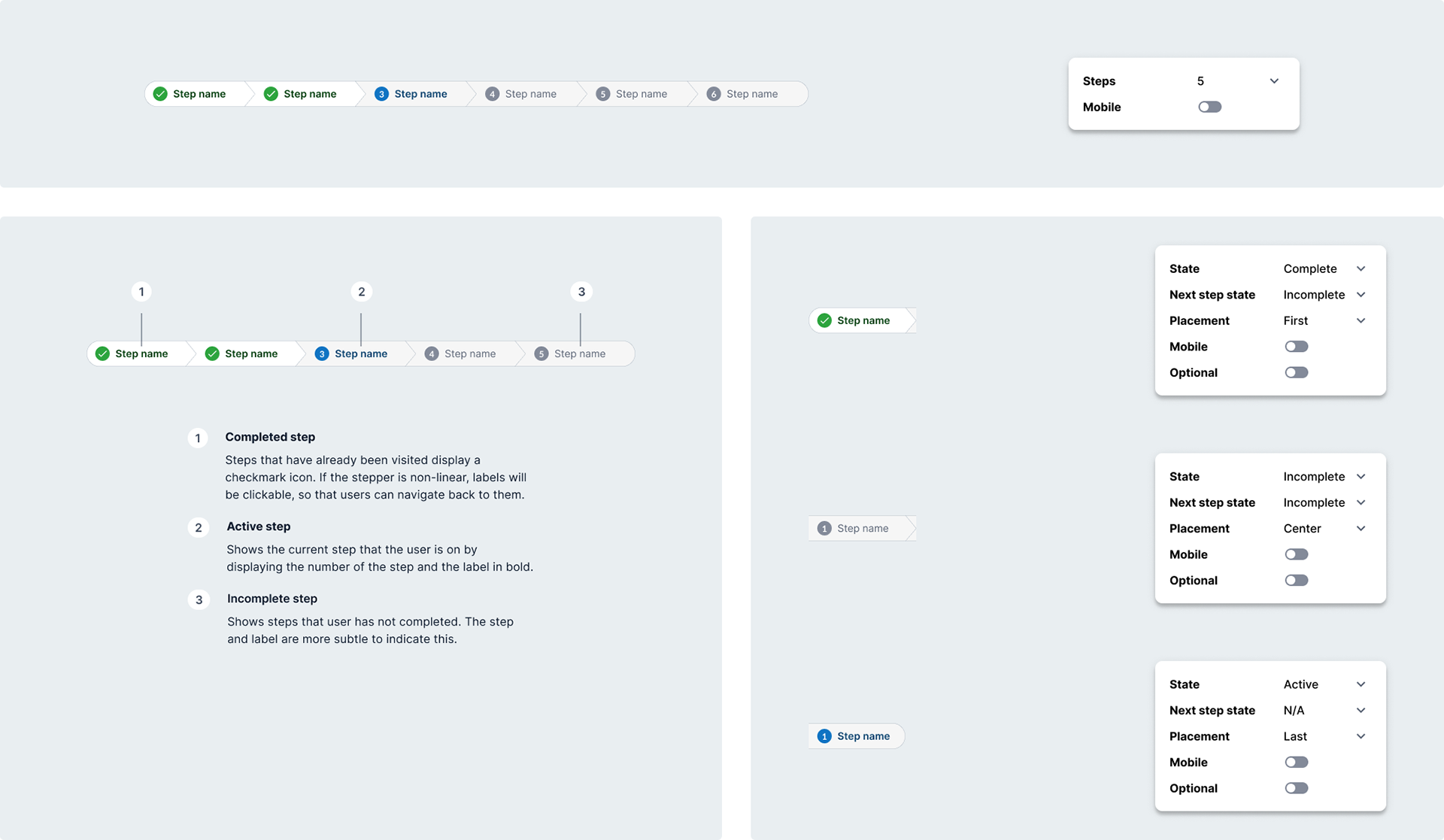
Final iteration of stepper component
Result
A complete design system ready to scale and evolve with the enterprise
We would learn that designing a system is an iterative process as we continued to receive feedback from designers on the design system and as well as the component library itself. Templates became a helpful tool especially for components that needed flexibility. As the first complete iteration of the design system for Cardigan, it has room for growth but it has already helped onboard new designers on the design team and facilitated faster design workflows for current designers.