Team
2 Lead Designers
4 Icon Designers
1 Production Designer
2 Project Managers
Role
My role as an icon designer was to take old iconography and transform them using our new visual design guidelines. I explored new metaphor concepts, proposed using duplicate iconography for similar functionality, and built out the icon scale for use across Office UI.
Overview
Microsoft Office is a family of productivity software and services that include products that have become household names: Word, Excel, Powerpoint, and Outlook. Subscription packages allow users to have these apps downloaded on Desktop or interact with the suite of Web applications. With a consumer base that is in both the home and enterprise space, Microsoft 365 has approximately 1.2 billion active users globally on a monthly basis.
Microsoft launched a UX refresh in 2018 that completed rollouts in 2019 across the entire family of apps. The software, UX, and UI got an entire face-lift to improve usability and accessibility, which also included changing the iconography, which is where my team came in.
Goals
Make it modern and accessible
Our task was to replace existing, highly-detailed metaphor image icons with an icon set that is simplified, modern, and scalable to enhance accessibility and modernize the user experience. The new icon set would also help to maintain consistency across all products in the Microsoft 365 experience.
Design guidelines
Speaking the same language
Giving thousands of icons a new face lift was no easy feat but it was made easy when a team of designers were speaking the same visual language. The guidelines we used not only brought consistency to our icon set but additionally allowed for scalability; it gave our team a foundation for our design decisions and was especially helpful for creating icons for new features.Base grid
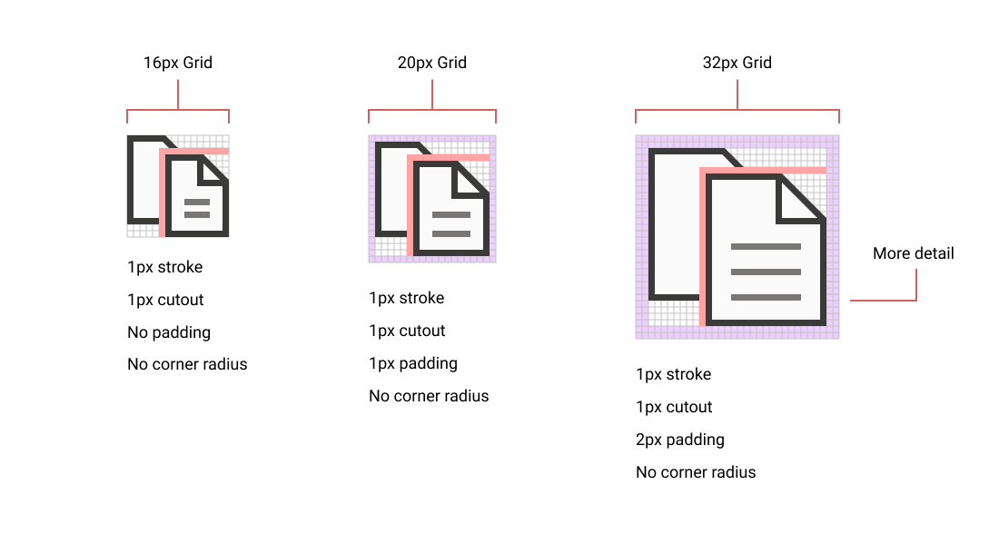
Most of our icons were built on a scale that included 16x16, 20x20, and 32x32. These were our most common sizes as 16x16 and 32x32 were used on the desktop application ribbon and 20x20 would be used in the web application ribbon. Based on UX needs we occasionally built icons in 24x24, 48x48, 64x64, and 96x96 grids which are used in different locations in the UI such as in dropdown select menus or in the What's New pop up experience.
Common elements
We worked with a set of common elements which were icons that we would frequently associate and see with Office tasks. We additionally had an accessible color palette established to help with contrast and theming, set a 1px stroke weight across all icons, 1px cutouts for overlapping elements, and no corner radius to create that harmonious look across all icons at all sizes. Each artist could determine whether different UI tasks could reuse the same metaphor for features across office.
Standard sizes for default ribbon in online applications
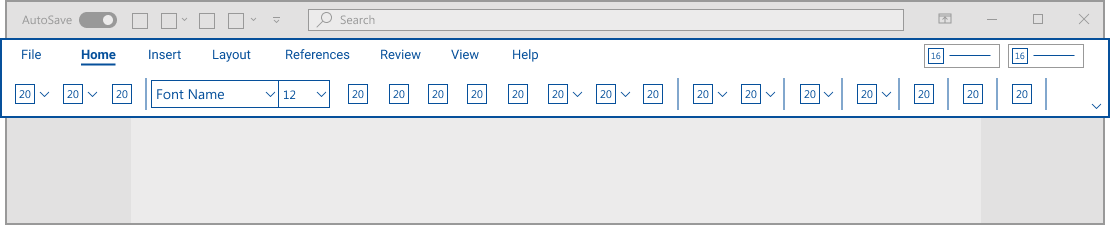
Standard sizes for expanded ribbon in desktop and online applications
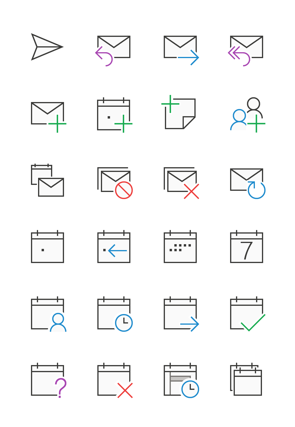
Outlook
Sending options and calendar icons
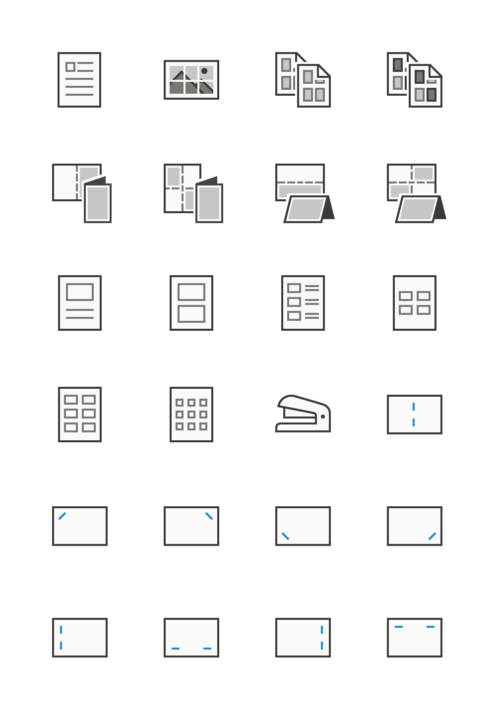
Publisher
Print options
Powerpoint
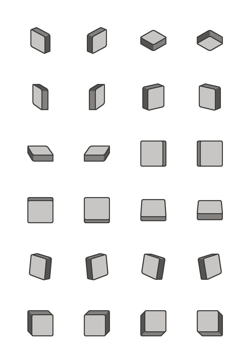
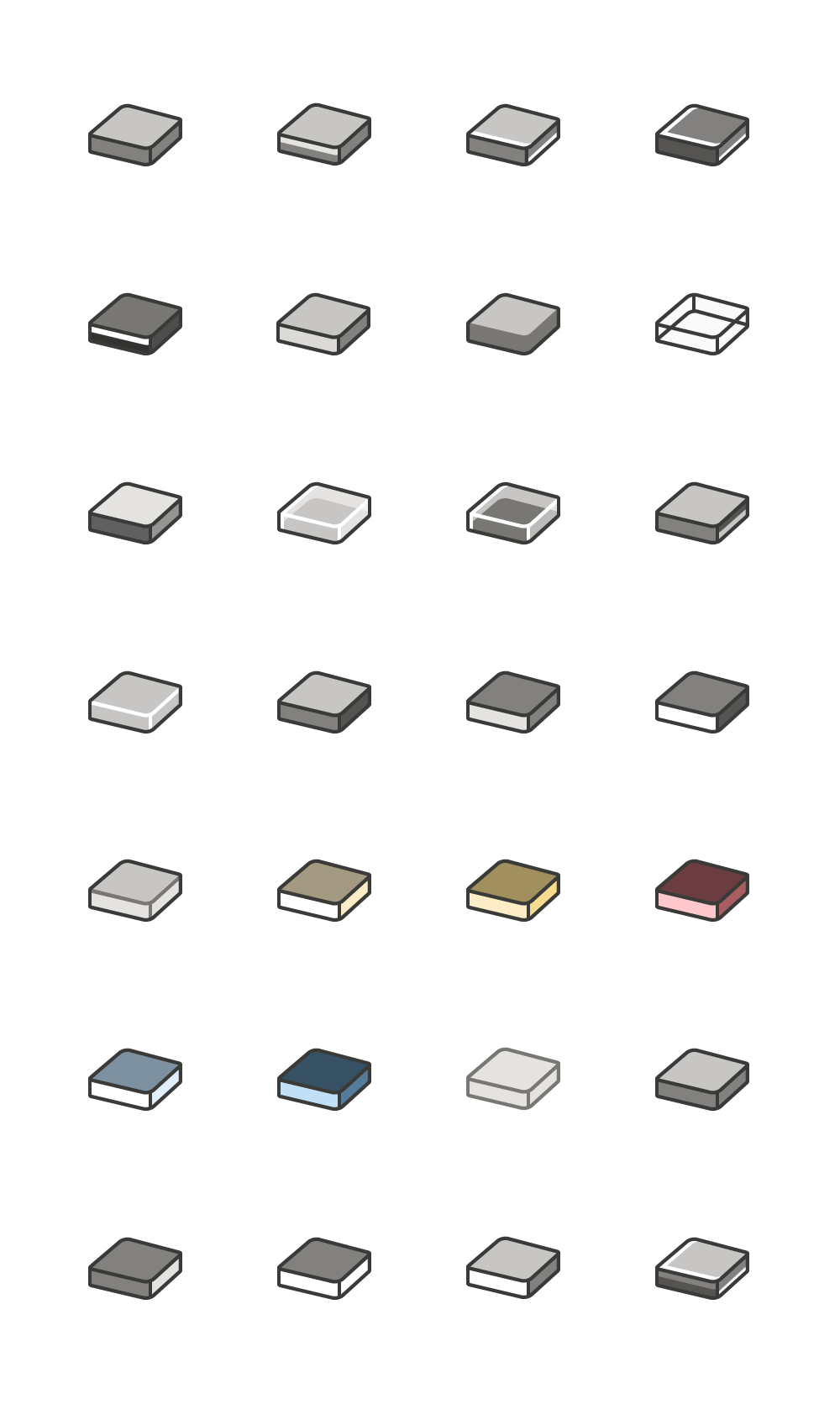
Preset effects for shapes
One of the challenges with this set of icons was that 3D shapes do not align to the flat style of the iconography and the effect had to be communicated with a limited amount of colors. I had to original gradient heavy 3D metaphors to align to style guidelines of icon refresh without the use of gradients by using a combination of transparent layers and solid shapes to create the subtle nuances of each effect. I found a balance between evoking 3D shapes with flat design.
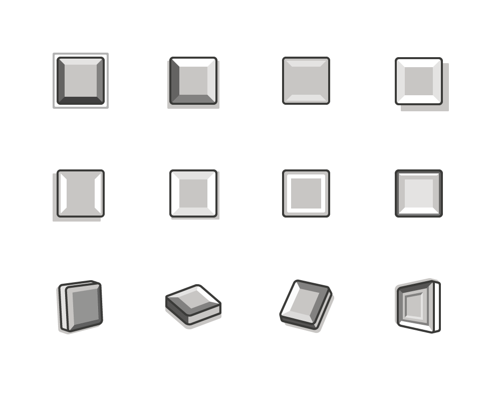
3D material and lighting effects for shapes
Borrowing from the nuances created for the preset shape effects, I used a cell shading technique to replicate the material and lighting effects for the shape onto a 2d design.
3D rotation effects for shapes
The least complicated icon set of the shape effects was the 3D rotation effect set where I created one shape and was able to mirror or rotate the icon to mimic the effect while maintaining consistency of the design.